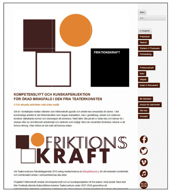
Logotype Friktionskraft, Teatercentrum
Logotype design for Friktionskraft, meaning friction force, a project by Teatercentrum about diversity on and off stage at independent theatres in Sweden. The logo uses the orange colour for it’s stronge impact. The square and the circle almost collide and create a visual contrast. It has been “created” by the create “friction” between the two squares, hinting at the diversity creating a force and being a positive contribution.
There are several complementary versions of the logotype, including an icon with just the symbol and no next. It also comes in three colour versions – orange (main one), green and red (complementary ones), and of course in black and white, as well as versions with the ball at the end to be used at the end of certain documents.
Read more about Friktionskraft in Swedish at www.teatercentrum.se/friktionskraft, and see the logo in use.


